creative consultants in visual communication > call 0800 6191 595 or email
visit our blog
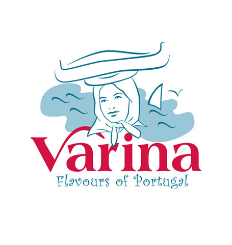
Varina
Portuguese food company, importing a quality range of authentic frozen food.
task
To create an authentic looking Brand identity, material and website that would raise their profile and increase sales.
what we did
Varina comes from the traditions of Portuguese women that used to carry the fish from the catch on their heads in a long basket. We created a strong and simple representation retaining the authenticity and traditional nature along with a modern style sea scene to reflect the core seafood business. We chose an icy blue to reflect the frozen nature of the products, and the dark blue/green and red that nodded a head at the Portuguese flag . (Had we used the actual red and green of the flag the colours would have clashed and cheapened the look of the Brand). Contrasting dark red typography and a quirky and distinctive upper and lower case font creates credibility and approachability, matched with a fun and curly supporting strapline, reminiscent of Portuguese design, the new brand is both memorable and professional. Applied across a range of material: ads, brochure, website and van livery.
result
The new identity gave credibility to this family run business.