creative consultants in visual communication > call 0800 6191 595 or email
visit our blog
Frost
A licensed insolvency practice offering business support and help as well as risk assessment, to both the commercial and domestic market.
task
To create a new brand and identity and to apply it over websites and other material, to accurately convey the company's unique approach to solving financial problems and supporting those having financial difficulties across a wide range of target markets.
what we did
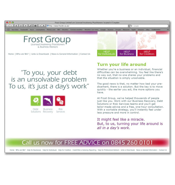
After extensive brainstorming with the client and encouraging them to focus on their core values and brand strategy we were able to conceptualise a softer and more positive approach and communicate their 'iron fist in a velvet glove' analogy using unexpected imagery. Icons were created from a dolphin, a sunflower and dice to reflect the differing areas of 'Business Recovery', 'Debt Solutions' and 'Rick Services' we used vibrant colours and modern business typography to communicate modern practices and modern thinking in a very tricky area of finance. Hand holding and support whilst delivering no nonsense practical advice and guidance were communicated using clean lines AND soft edges, bold imagery and strong copy bringing the whole identity together in material and website, where the vibrant colours are a huge and refreshing change compared to other IPs Brand, PrintThe three icons and their colours where brought together for the Group Identity, creating an impactful and memorable brand.
result
The new brand, literature and website has increased their enquiries and raised their profile, loyalty to the brand has increased both internally and externally with clients and others passing positive comment. They are delighted testimonials