creative consultants in visual communication > call 0800 6191 595 or email
visit our blog

Dance Matrix
A network of dance clubs, training facilities and dance teaching expertise.
task
To create a new brand to communicate the fun of learning to dance as well as the expertise and variety of training available nationwide.
what we did
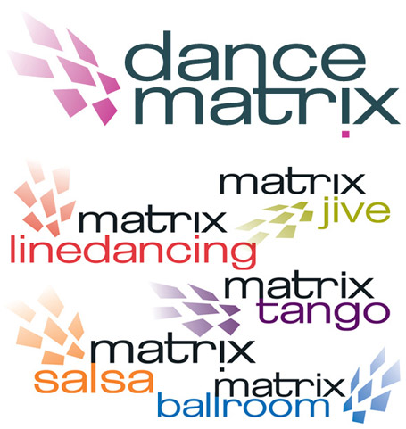
We wanted to combine the 'network/grid' of the nationwide club along with the dance element. The mirrorball cleverly combined both these; as the archetypal symbol of dance halls that is conveniently made up of a 'grid' of tiny mirrors! We then created a stylish logo drawing on the dance hall emotions generated by the light refracted shapes the mirrorball throws. Using different colours for different dance styles, creating a flash of shapes dynamically dancing across the page. Resisting the temptation to try and show each dance style or to alienate any age group, this soft and friendly logo accurately represents the core values of dance, movement, fun and togetherness as well as the expertise available. Bold lowercase typography keep it firmly in the 21st Century, whilst retaining a friendly face with its vivid palette of colours.
result
A new logo, website and material have unified a network of clubs and teachers giving its members a sense of belonging, raising the profile of the organisation and increasing membership.