creative consultants in visual communication > call 0800 6191 595 or email
visit our blog
Eurofins
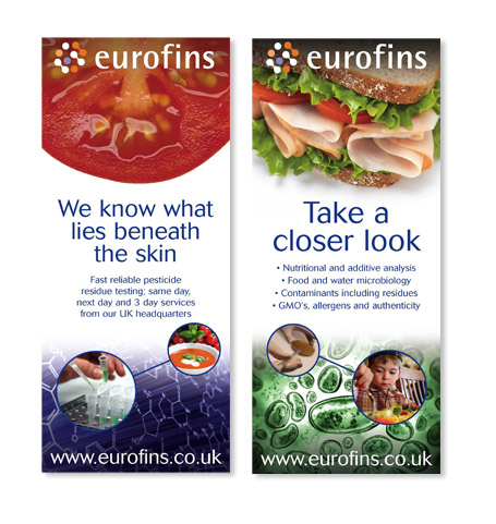
Worldwide Laboratories. The food sector tests for disease, bacteria, pesticides, provenance, nutrition information etc in food stuffs.
Task
To create a visual identity for the food sector of Eurofins, principally for adverts in the Trade presses, and for exhibition stands in order to create a more impactful impression. To attract attention and to make more approachable and give Eurofins a bigger slice of the UK market who were perceived to be a large European company disconnected from the UK customer.
What we did
We wanted to get to the real essence of Eurofins and at the same time create a big impression. We came up with the concept of 'Taking a Closer Look' which gave a much more visual impression to what otherwise might look too technical. To give real impact we used close up images of food - then even closer to the actual bacteria, cell structure and chemical breakdown. The combination of this imagery created a really stunning concept. We further added to the concept by showing images of how the food ends up - ie the tomato in the soup that is eaten by the boy which demonstrates the importance of testing for impurities that could damage health, and giving the human element. We also added some lab images to make sure it was clear what Eurofins do, and put the images in 'cell-like' graphics.
Result
Rather than having boring laboratory photos Eurofins now have a bright, imaginative concept that is really eye catching as well as informative. We also built in the ability to expand the concepts with different imagery to keep the Ads looking fresh.