creative consultants in branding, packaging & print.
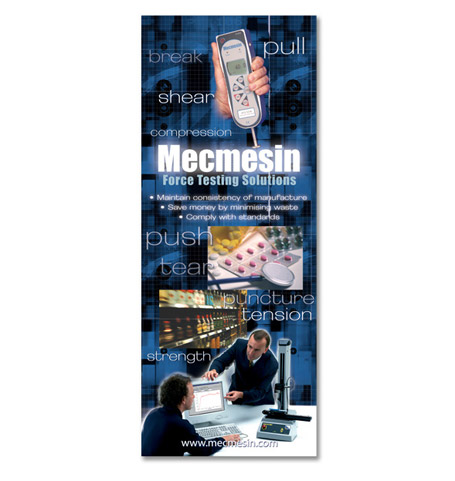
Mecmesin
A company involved in 'force and torque' technology, offering equipment to a broad range of clients in varied sectors.
task
We were asked to create a new brand and visual identity based on their existing logo but with more dynamism and energy
what we did
The Mecmesin identity was a little lacklustre, focusing on products rather than the benefits to clients. We turned this around by using a baby eating for 'food safety' rather than a food safety gauge.. Along with a variety of images, softened into a grid background with overlaid words relevant to each sector, we created a large portable exhibition stand which focussed on application of their gauges and technology. Different sizes and styles of banner gave them loads of flexibility for usage and longevity, We also created display artwork for their offices reception as well as a looped video.
Result
The dramatic shift from product to application has seen huge success as a result, banners have generated more sales enquiries and across all the material there is a unified message and one that all in the company have invested in creating loyalty on all fronts.