creative consultants in visual communication > call 0800 6191 595 or email
visit our blog
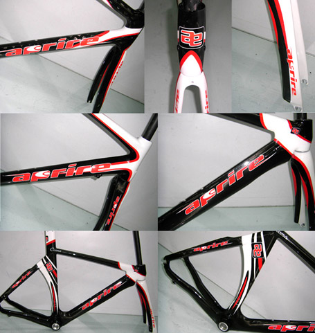
Aprire
Young independent bicycle design company.
task
To create a new brand and cycle graphics to compete in a highly competitive and style sensitive market, with a flavour of Italy - who are perceived as the supreme bike designers
what we did
Starting with cycling and speed as a concept we created a strong and sleek brand logo which fits to the extreme constraints of carbon fibre cycle frames with their long thin and undulating shapes in three dimensions. With Italian colour overtones and name badges aimed at a young and athletic market we created new graphics for various new frames from road to high end track racing. Using a series of shapes (based on the aerial view of a racing cyclist) and stripes to wrap speed and movement seductively around the frames, matched with a badge icon version of the logo, we abstracted the logo and its elements and applied it in subtle ways to strengthen the brand.