creative consultants in visual communication > call 0800 6191 595 or email
visit our blog

Creative Spain
A destination management company with a different and more creative slant on business travel.
task
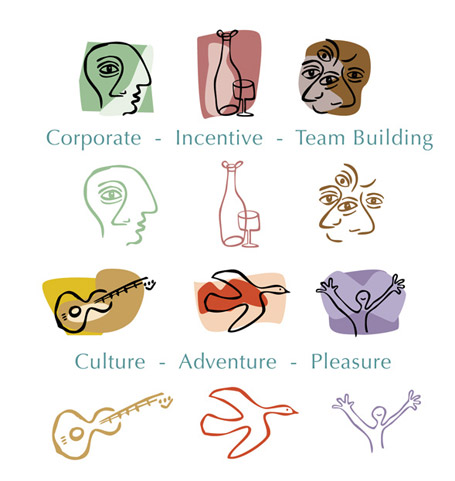
To create a new brand to accurately convey the company's creative and unique approach along with their intimate knowledge of Spain.
what we did
A company that specialised in Spain and professed to be creative and different, naturally pointed us to the great Spanish artist and exponent of Cubism, Pablo Picasso. We created a strapline - 'Seeing things from every angle' and came up with a series of illustrative icons in the style of Picasso that when combined into a brand logo reflected the brand's values and aspirations. We used our knowledge of colour psychology to assign each icon a colour befitting a different area of their business, so purple was applied to a free spirited character used for the more pleasurable aspects of destination management. These icons were used throughout their literature and identity material, allowing them the flexibility to lift one and run a separate promotion on one business activity. The colours connect emotionally and communicate on many levels, combined with more serious corporate logo colours it still retains that all important air of credibility and business.
result
The new brand and literature increased their sales enquiries and improved their offering. It raised their profile and generated more publicity for the launch of the brand.