creative consultants in visual communication > call 0800 6191 595 or email
visit our blog
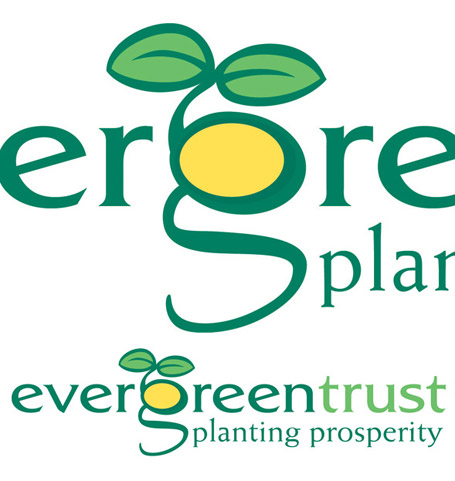
Evergreen
A charity working in Africa to promote the planting of trees and their importance to sustainability and soil quality.
task
To move this vibrant and young charity away from all those global caring clichés of worlds and hands, with a new brand and material.
what we did
We looked at the core of what they did - planting trees, creating life. We came up with a seedling embedded within their logo to replace the 'g' which communicated the new life and growth they offered. The typography is lowercase so it is approachable and friendly BUT the font has a serif, drawing it back to a credible business position, encouraging donations and trustworthiness. Happy 'e's' with a smile on their face reflects the positive and happy personality of the charity. We used spring colours to communicate renewal and came up with the strap-line 'planting prosperity' in a solid serif font to complete this memorable brand with so many positive subliminal messages.
result
The unique new brand, plus website and signing and literature have all served to re-postion this charity with more credibility and fundraising power. New letterheads alone have secured more donations from mailouts. Print.