creative consultants in visual communication > call 0800 6191 595 or email
visit our blog

Food Club
A business support organisation aimed at those involved in the food industry.
task
To create a new inspiring and more professional brand for this networking organisation.
what we did
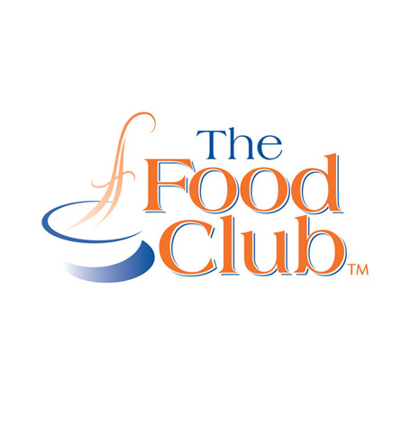
We created a unique, foodie but business like brand logo for this eclectic group, who offer a range of expertise and information to support small food manufacturers along with networking and eating! Not wanting to alienate any particular sector we created a logo generically representative of food, with a soft and friendly 'fc' gently swirling to create the aroma/steam in a bowl, as food tends generally to be cooked and presented in a receptacle. We retained a business feel through use of colour and typography. The dark blue is a safe business colour and tone, the orange used for warmth, food and sociability.
result
The new brand has solidified the Food Club's position as a leading resource of expertise and support, positioning it to reflect the values and aspirations of all involved.