creative consultants in visual communication > call 0800 6191 595 or email
visit our blog
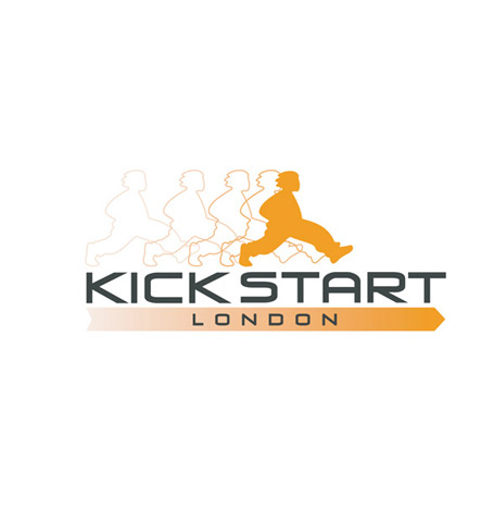
Kickstart
A London based charity offering support and accommodation to young people leaving care.
task
We were asked to create a modern and yet credible identity for this small friendly charity, which would appeal to both its clients and those offering support both practically and financially.
what we did
We created a strong a memorable logo with youth appeal so their clients would feel part of something bigger, a logo which also has enough credibility to put other stakeholders at ease. The genderless character is striding out with renewed confidence. A business feel is created with the use of grey, matched in vibrancy and energy with sharp orange for renewal and optimism. Striking new stationery and website bring all elements together to form a consistent and unified brand message.
result
A strong and memorable logo that has broad appeal and creates a more professional feel.