creative consultants in visual communication > call 0800 6191 595 or email
visit our blog

Creative Spain
A destination management company with a different and more creative slant on business travel.
task
To create a new brochure to accurately convey the company's creative and unique approach along with their intimate knowledge of Spain and present their offering in detail.
what we did
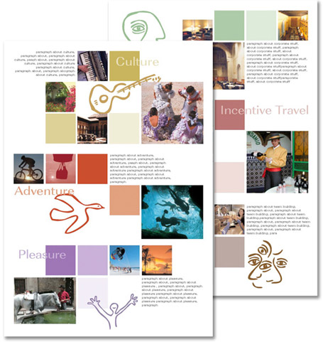
Utilising the brand and icons we already created and our strap line 'Seeing things from every angle' we used our knowledge of colour psychology to clearly define each area of their business within a premium brochure, so viewers could easily choose the package appropriate to them. Colour and icons were used throughout their literature and identity material allowing them the flexibility to lift one and run a separate promotion on one business activity. The colours connect emotionally and communicate on many levels, combined with more serious corporate logo colours on the cover it still retains that all important air of credibility and business.
result
The new brand and literature increased their sales enquiries and improved their offering. It raised their profile and generated more publicity for the launch of the brand.