creative consultants in visual communication > call 0800 6191 595 or email
visit our blog

IRS
A family-run company that offers Office design, refurbishment and relocation.
task
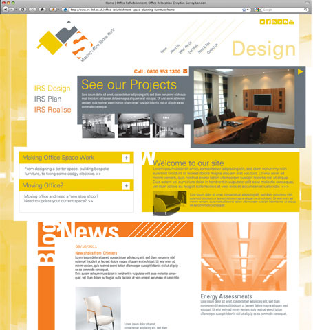
A total rebrand incorporating a brand new look that better represents the company's creativity.
what we did
Making a different impression was key in our thinking. We had already designed the 'blocky' logo that not only represented spacial design but alluded to the Bauhaus movement which also created a concept for the web design layouts. One of the main objectives of the Bauhaus was to unify art, craft, and technology - which sums up IRS's offer succinctly. To show IRS's creativity and practicality we designed each page with a different layout, using the idea of the Bauhaus to create interesting spacial layouts and blocks of colour, whilst still being easy to read and update.